Predicting modern patterns of affluence through vectorisation and spatial regression of Charles Booth’s poverty maps
This is a relatively brief account of the final project I completed for my MSc at UCL, the full paper of which (with references) is available here.
Charles Booth and his pioneering maps
Businessman, politician and social scientist, Charles Booth lived from 1840 to 1916 – a time of growing interest in the plight of the urban poor. Concerned by the extent of poverty and the perceived sensationalism with which it was reported, Booth set out to give it a full and proper accounting.
His investigation ran from 1886 to 1903, at a personal cost to Booth of the equivalent to three million dollars today. It revealed that the true figure for those living in poverty was around 33%, and produced prodigious amounts of research material. Of these, it is the poverty maps that are probably most familiar to the general public. The Museum of London for instance hosts a room dedicated to the maps, with a touchscreen display where visitors can explore a composite version of them.
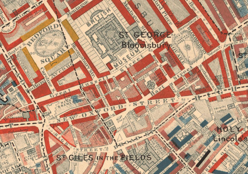
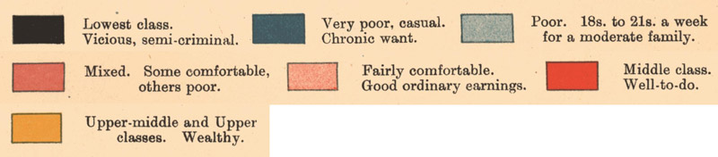
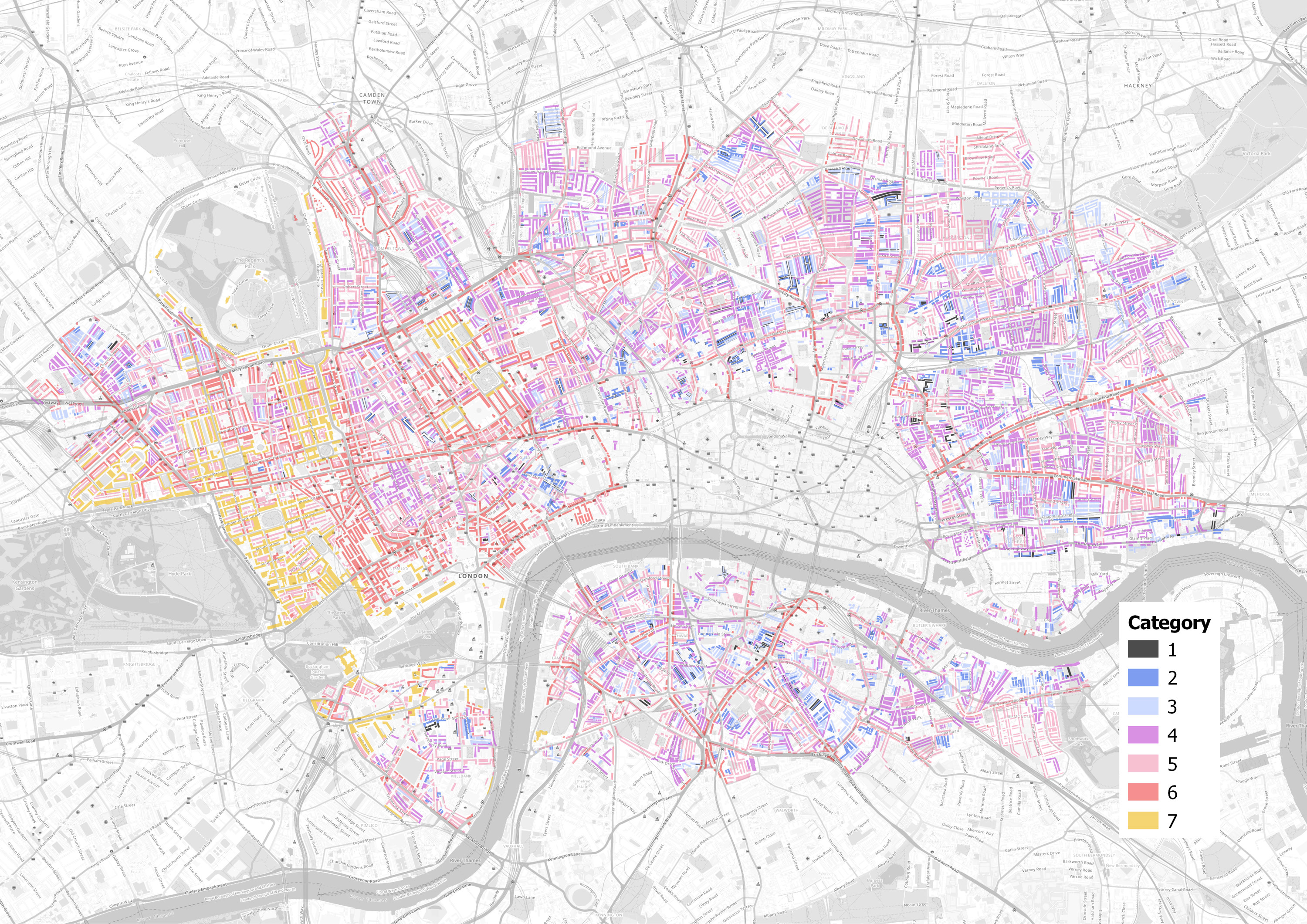
Booth’s poverty maps showed the houses and streets of London colour-coded with seven categories. Above is an extract from one of the maps, and below it are Booth's seven categories. Despite their name the maps do not just display poverty, but rather relative wealth at both ends of the scale, and although the language used in the category labels makes frequent mention of class (and is rather Victorian in tone), Booth’s categorisation was based on a variety of factors including employment status, regularity of income and type of occupation.
Inevitably there are shortcomings to Booth’s methodology when held up against modern standards. Research has shown however that Booth was rigorous and consistent in his classification of data, and so we can at least rely on the study’s internal consistency. This forms the first major assumption of this analysis: that Booth’s work forms an accurate record of relative levels of wealth, and of their geographic distribution.
Vectorising messy maps
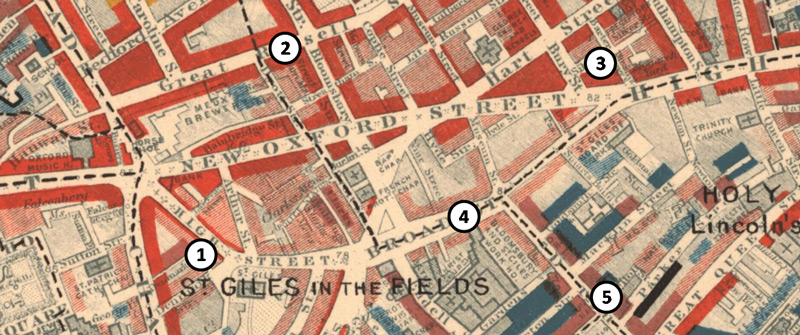
High quality digital scans of the maps are available on the LSE website, but unfortunately are not immediately suitable for spatial analysis, due to the sort of issues shown above. 1) The maps are covered with annotation of streets, buildings, and neighbourhoods; 2) Administrative areas are marked with dotted lines that pass through buildings; 3) Colours are not uniform, with overlapping text and building outlines; 4) Two categories use diagonal hatching made up of two different colours; 5) The lowest category uses the same black as the dashed borders. Before spatial analysis is possible, the files needed to be converted into clean digital vectors.
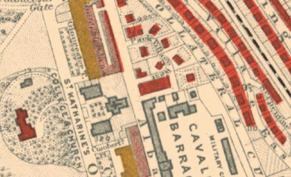
A further issue with vectorisation of the maps is that their colouring pays varying attention to the actual layout of buildings beneath it, as shown below. After considering various other approaches, this project took the approach of fully reproducing the colouring of the Booth maps. This forms our second major assumption, that distortions to data due to this issue will be even between categories and areas, and not unduly impact on our ability to compare them.
Doing it the hard way
One day we will be able to pass these scanned maps to an algorithm that will hand back perfectly formed vectors, labelled with the correct category. Unfortunately that day is not today. After various experiments with adjusting the image for use with existing applications that attempt this automated approach, and reviewing open source projects that have had success with automation, it became clear that the only immediately practical means of vectorising the maps was manually.
The vectorisation process took at least 45 hours to complete in QGIS, and eight of the twelve Booth maps were fully or partially covered. The City of London area was note surveyed by Booth and so appears as a blank space in the dataset.
The dataset comprises 11,539 polygons, and each has an attribute describing its Booth colouring. Manual work like this is very vulnerable to human error, so various automated and further manual checks were made of the data to catch these mistakes.
Spatial analysis of the Booth data
In order to determine the relationship between our Booth data and modern patterns of affluence, the two datasets needed to describe the same geographical areas. Modern data is not typically available at the household level, so the Booth data had to be aggregated to modern geographical areas that we have relevant data for. In this case we used Medium Super Output Areas, generated from the 2001 census and intended to form stable geographical units for reporting statistics over time. A GIS workflow was then used to split apart the Booth data polygons and reattribute them to each MSOA, shown in the flowchart below.
| Dissolve the digitized polygons according to their category attribute, producing seven multipart polygons
⇓ Intersect the multipart polygons with the MSOA polygon data, resulting in separate multipart polygons for each category within each MSOA ⇓ Calculate the area of multipart polygons within each MSOA |
From here, the area value for each of Booth’s categories within the MSOA could be calculated. These were then combined into a single value by multiplying the areas by a category score and dividing by the total value of those areas. the table below shows a simplified example of this process.
| Booth Category | Area | Calculation | Total |
|---|---|---|---|
| Category 1 | 200 | 1 × 200 | 200 |
| Category 3 | 300 | 3 × 300 | 900 |
| Category 5 | 100 | 5 × 100 | 500 |
| Category 6 | 50 | 6 × 50 | 300 |
| 650 | 1900 | ||
| Booth score is 1900 ÷ 650 = 2.92 | |||
Summarising and visualising the Booth data
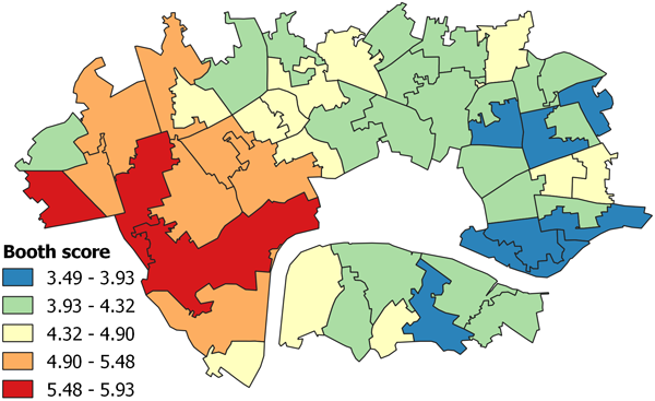
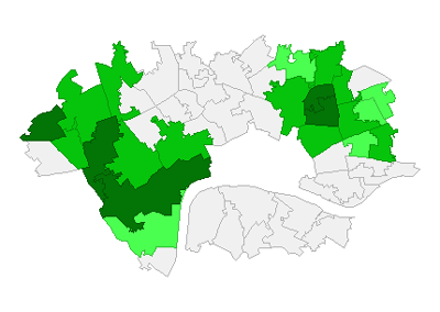
Shown below is the Booth score data as a choropleth map. Already we can visually identify a pattern in the data, with higher ranked MSOAs found in Westminster borough adjoining Hyde Park, and lower ranked MSOAs in Tower Hamlets to the east.
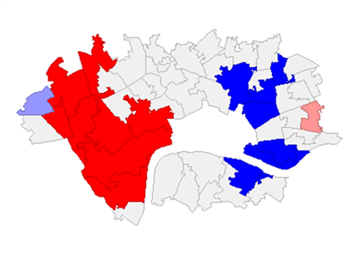
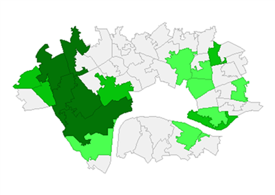
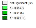
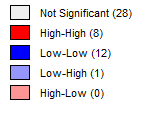
That said, we cannot always trust the human eye to accurately gauge these patterns of clustering in the data, and so mathematical measures were used for verification. The first was Moran’s I, a popular measure of spatial autocorrelation that provides a value between -1 and 1, where 0 describes complete randomness, -1 describes perfect dispersion and 1 describes perfect clustering of similar values. If this measure shows clustering is present, a Local Moran’s test is then used to produce statistics for each geographical area, allowing us to identify and visualise those clusters. Both measures are accompanied by tests to verify that the results are statistically significant.
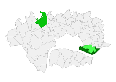
The Moran’s I test confirmed that clustering was present in the Booth score data, and the results of the Local Moran’s test was used to produce the visualisations below. The first shows clusters detected by the test, and the second their relative significance. This confirms the existence of significant clustering in the west and east.
Selecting a measure of modern affluence
Various different modern indicators were considered for comparison against the Booth data. First was the Index of Multiple Deprivation, the official measure of relative deprivation in England. Our Booth data however does not solely focus on poverty, but rather the full spectrum of affluence. The measurement of affluence in an area cannot be achieved with the IMD: the absence of poverty from an area does not necessarily correlate with its affluence. Indeed, the official guidance of the IMD specifically notes that it should not be used in this way.
Measures of income were considered next. Initially it seemed well suited, given Booth’s own focus on patterns of employment and income. However, income as a measure of affluence is by no means perfect: surveys of household income have been found to frequently fail to accurately capture the wealth of the richest households.
These limitations have led to adjusted approaches, such as the incorporation of real estate data – which is where this project ultimately took it’s chosen measure from. Every year the Valuation Office Agency publishes the number of properties by council tax band in each MSOA. This dataset is regularly vetted for consistency, draws on a highly detailed dataset, and also measures the full spectrum of affluence.
As with our Booth data, a single Modern Affluence (MA) value was required for each MSOA, to allow comparison. The same process was used, with each council tax band from A to H assigned a value from 1 to 8. Again, the table shows a simplified example of this process.
| Council tax band | Assigned value | No. of properties | Calculation | Total |
|---|---|---|---|---|
| B | 2 | 400 | 2 × 400 | 800 |
| C | 3 | 600 | 3 × 600 | 1800 |
| F | 6 | 1000 | 6 × 1000 | 6000 |
| H | 8 | 800 | 8 × 800 | 6400 |
| 2800 | 15000 | |||
| MA score is 15000 ÷ 2800 = 5.36 | ||||
Summarising and visualising the Modern Affluence data
As with our Booth score analysis, below are choropleths of the MA scores, and of the Local Moran’s measure results. Both maps show a cluster in the west almost identical to that found in the Booth data. In the east there remains a cluster of lower scoring MSOA, but it has moved north, away from the river.
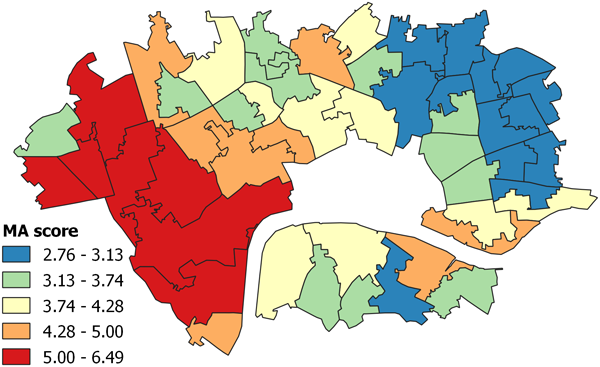
Interestingly, both the Local Moran’s for the Booth and MA scores show an low outlier to the north-west. This may hint at the existence of a larger cluster of low values west of the area chosen for study.
Comparing the two datasets
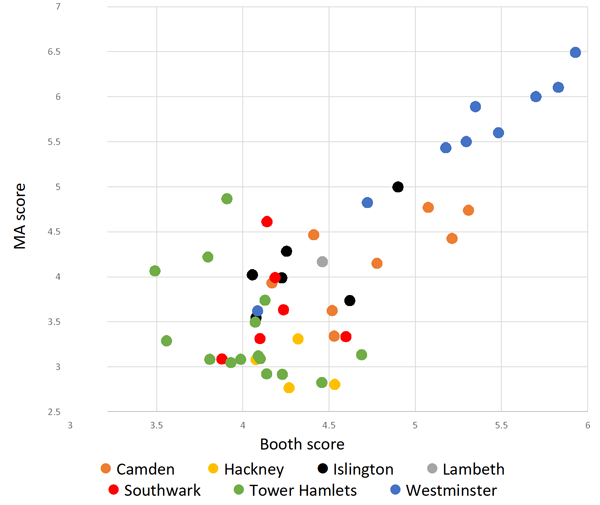
With our two datasets now aggregated to single values for each MSOA, we were able to investigate the relationship between the two. The plot above shows MSOA Booth scores plotted against MA scores, and suggests two clusters are present: between 3.5 and 4.75 on the x axis, the data is noisy and does not display a clear relationship. After the Booth score reaches 4.75, the relationship appears much more linear.
It is clear from this graph that high performing areas in Booth’s time are more likely to be high performing today. Figure 25 below is a slope chart linking the rank of MSOA across both datasets. This visualization makes readily apparent the different experience of higher ranking areas and moderate and lower ranking areas between our data sets.
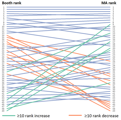
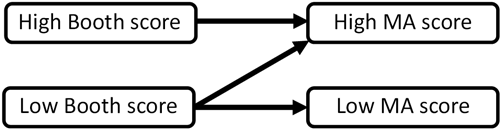
In the intervening 120 years between Booth’s work and our modern data, relatively high performing areas have generally remained so. Lower performing areas exhibit far more varied outcomes, with some remaining relatively less relatively affluent, and others becoming more so. This general rule is depicted below. What this does not tell us however, is to what extent the Booth score of an area is actually able to predict modern day affluence.
Can Booth data predict modern affluence patterns?
In order to answer this question, the data was normalised and subject to regression analysis. Initially an Ordinary Least Squares regression was used, and seemed to confirm the existence of a convincing relationship, with an R-squared value of 0.575 and an unambiguous p-value. However, these findings can only be considered reliable if the underlying mathematical assumptions of the linear regression model are met.
One of those assumptions is that error terms in the model must be independent. In this instance, the fact that the data value of a geographical area is heavily related to the value of those around it breaks this assumption. The existence of this ‘spatial auto-correlation’ is hardly surprising, given its presence in both the dependant and independent variables (our MA and Booth scores), and the obvious visual similarity of the two maps of these scores.
To remedy this spatial auto-correlation, a type of regression called the Spatial Lag Model was used. The SLM is designed to accommodate and compensate for the presence of the type of spatial dependency identified here. The results of this model are shown below. The R-squared value of 0.699 suggests that our new model is able to explain almost 70% of our modern affluence score. That said, the test for spatial dependence has returned a significant result, which shows that although the model is improved, it was not able to completely account for spatial auto-correlation.
| R-squared | 0.699 |
|---|
| Variable | Coefficient | z-value | Probability |
|---|---|---|---|
| Booth score (normalised) | 0.555 | 5.067 | <0.001 |
| Spatial lag adjustment | 0.474 | 4.265 | <0.001 |
| Test for spatial dependence | Value | Probability |
|---|---|---|
| Booth score (normalised) | 13.887 | <0.001 |
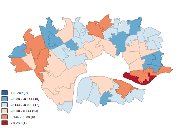
In order to evaluate our model further, the choropleth below shows the standard deviation of the values our model predicted for an area, compared to their actual value in the data. We again ran a Local Moran’s test on this data to highlight truly significant clusters, shown in the second two maps below. This reveals that an area of Tower Hamlets in east London is the strongest source of disruption to the good fit of our model.
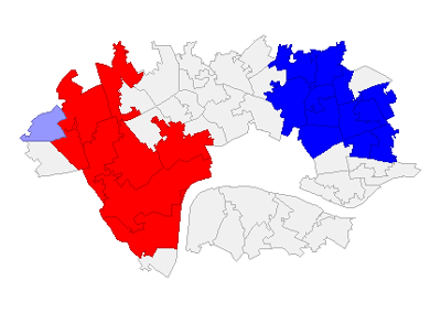
Removing Westminster
At this point, it was considered that the Westminster MSOA could be exerting an overly strong influence on our data. They dominate the highest ranks of both the Booth and modern affluence scores, exhibit strong clustering, appear to be relatively linear compared with other borough groups.
To test this hypothesis, the Westminster MSOA were removed from the data and the analysis run again. The results of this test should be considered only indicative, as the removal of the Westminster data will affect our results in other ways, such as some remaining MSOAs have losing one or more neighbours, and a reduction in overall selection size.
The Spatial Lag Model for this new data showed a reduced R-squared of 0.421. This does suggest that Westminster exerts a strong influence on the relationship between Booth and MA scores – but not so much that we should dismiss our overall model.
Ground-truthing our findings
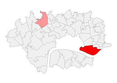
In order to evaluate our model further, two clusters were selected for further, qualitative verification: the Tower Hamlets cluster focused around Wapping that disrupted our model, and the Westminster cluster, exerting considerable influence over the model and dominating the upper ranks of both original datasets.
Tower Hamlets cluster
This cluster is made up of two MSOAs, both of which started with low Booth scores and have exhibited marked improvement – one was originally ranked 44th (of 49) and the other 47th. In our MA scores they now rank 9th and 17th respectively. The former was the only MSOA to move from the bottom 20% of Booth ranks to the top 20% of MA ranks. This are certainly outlier cases – but are they errors?
In Booth’s era Wapping was part of the docks of London. While the docks themselves were bustling, the income and living conditions of local labourers were bleak. Only a small proportion of labourers were permanently employed, with the majority hired for short term labour on a daily basis, selected from crowds of hundreds who gathered at the gates. Walter George Bell wrote of a walk through Wapping in 1910, describing it as ‘the foulest, the most loathsome spot in all London’.
The docks themselves were heavily damaged in wartime bombing, and by 1981 had closed completely. Then the government-owned London Docklands Development Corporation was established and made responsible for regenerating the area. It is these efforts that likely explain the impressive change in the areas performance in its Booth and MA scores.
Wapping hosted News International for a time (owners of the The Sun and The Times newspapers), and now is home to various high value residential and commercial developments. Those values are likely buoyed by the proximity to the financial district of Canary Wharf. It would be valuable to extending the Booth vectorisation to include the full docklands area, allowing Canary Wharf itself to be included within our model.
High performing Westminster group
This cluster is notable for dominating the top ranks of both datasets. Indeed, the same 5 areas make up the top 5 ranks in both scores, and within that the top three have remained in the exact same rank, with only the 4th and 5th ranked areas changing places. How has this cluster remained so dominant, despite the passage of 120 years?
These MSOA cover a broad area and one that defies easy summary. Mayfair, and to a lesser extent Marylebone, were the home of the aristocracy. Many had moved there from Soho, which in Booth’s time the area was undergoing a transition, with theatres opening and restaurants gathering renown. Today it remains a hub for both gastronomy and entertainment, and is bordered to the north by Oxford Street, one of the busiest shopping streets in Europe.
Housing in these areas has retained its relative value, and the area attracts international buyers looking for long term investments. Mayfair was chosen as the most expensive square on the board in Monopoly in 1935. A 2013 study by Halifax showed that of all the Monopoly spaces, Mayfair remained the most expensive area today.
Finally, Westminster contains some of the most famous and important buildings in the United Kingdom, such as the Houses of Parliament, Westminster Abbey, and 10 Downing Street. It also contains Buckingham Palace, which is diligently coloured yellow on Booth’s map, the highest category, and unsurprisingly allocated to the highest possible band of council tax today.
Conclusions
Using a spatial lag regression model to account for spatial dependence in our data, we were able to determine that the Booth poverty map data is a strong predictor for modern affluence. Where the model was under-predicting affluence, we were able to identify some possible explanations for its failure – the large scale regeneration of the area and proximity to Canary Wharf.
The implications of these findings are complex, and invite follow up work. The strength of the relationship between Booth and MA scores suggest that patterns of affluence have remained largely intact over the last 120 years. While MSOAs have experienced varying changes in rank, these shifts are generally minor and have not disrupted overall patterns of affluence. However, the example of the Tower Hamlets cluster suggests that regeneration efforts can disrupt the continuity of these patterns.
If our study area was extended to include all of the docklands we would likely gain greater insight into the impact of the regeneration on the Booth-MA relationship. However, though the degree of change in the docklands is remarkable, it is not the only area that has been subject to regeneration. It would be useful to determine the location of noteworthy areas of regeneration within the study area, in order to better understand its impact.
There are other interesting findings that suggest follow on work. Our data showed that while some poor areas had remained relatively less affluent and others had increased dramatically in affluence, richer areas had much lower tendency to experience significant decreases in affluence. Our qualitative look at Westminster suggested our data is accurate, but did not provide any real insight into this resilience.
Through developing our understanding of how areas have experienced the intervening 120 years, we may be able to improve and add complexity to the model. Of particular interest might be characteristics of the areas that provide links between the two time periods, such as the presence of surviving buildings.
It would also be valuable to identify other historical resources describing patterns of affluence in London for other points in time between Booth’s inquiry and our modern data. Building a timeline of data would allow us to better understand the impact of changes over time, such as regeneration efforts.Finally, looking to the future, it would be interesting to periodically repeat this exercise with new affluence data, in order to track the longevity of the patterns of wealth and poverty observed in Booth’s data, and how they might continue to influence successive generations of Londoners.
For other projects, return to the main page.